TagsInput
In progress
ARIA
RTL
TagsInput is an extension of the text input fields. This component allows users to both enter text and capture input results and display them as well.
These selected text entries are being displayed as tags. Tags represent a set of interactive keywords that help organize and categorize objects.
Tags can be added by pressing the Enter key or removed by Backspace key or the mouse click from the input element.
Default
Different sizes
States
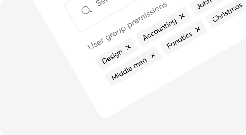
Preset data
Informative message holder
Preset data
Informative message holder
Uppercase & lowercase
Preset data
Preset data
TagsInput props
| Name | Type | Required | Default | Description |
|---|---|---|---|---|
| selected | string[] | Yes | - | The selected dataset |
| label | string | undefined | No | - | Label title |
| size | sm | md | lg | No | md | Input size |
| type | date | datetime-local | email | number | password | search | tel | text | time | url | string | No | text | Input type |
| placeholder | string | No | - | Placeholder for input |
| isError | boolean | No | false | Sets error state for input |
| disabled | boolean | No | false | Set disabled/non-disabled |
| className | string | No | - | Tailwind classes for customization |
| onEnter | (value: string) => void; | No | - | The function to select the text and append it to the tag set. |
| onClear | (index: number) => void | No | - | The function to remove the selected tag. |
TagsInput.SelectedItem
| Name | Type | Required | Default | Description |
|---|---|---|---|---|
| className | string | No | - | Tailwind classes for customization |
| index | number | Yes | - | This data spcifies the key value of the item |
| label | string | Yes | - | The text selected as tag |