Checkbox
ARIA
RTL
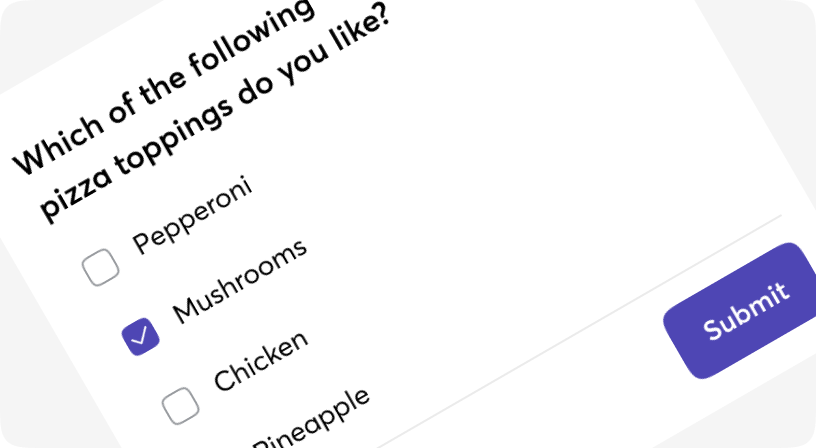
The checkbox is shown as a square box that is ticked (checked) when activated.
Checkboxes are used to let a user select one or more options of a limited number of choices.
Default
With Label
Checked
Disabled
ReadOnly
Partially selected
Customization
Checkbox props
| Name | Type | Required | Default | Description |
|---|---|---|---|---|
| bgColor | string | No | bg-piccolo | Checked state of checkbox |
| label | JSX.Element | string | No | - | Describes checkbox's purpose |
| indeterminate | boolean | No | - | Set checkbox as indeterminate and does not modify the checked state |