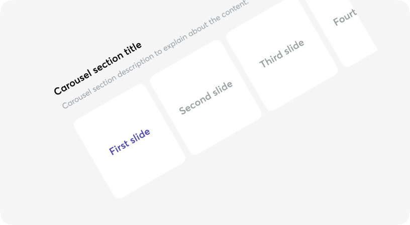
Carousel
ARIA
Is an effective way of displaying multiple images or content in a single space.
It not only helps in saving screen space, but also encourages visitors to focus on important website content and improves the overall visual appeal effectively.
To support Arabic languages this component requires setting up isRtl prop directly.

Anatomy
<Carousel>
  <Carousel.LeftArrow>...</Carousel.LeftArrow>
  <Carousel.Reel>
    <Carousel.Item>...</Carousel.Item>
  <Carousel.Reel>
  <Carousel.Indicators/>
  </Carousel.RightArrow>...</Carousel.RightArrow>
</Carousel>
Carousel
Customized Arrows
Indicators
Spaces
Visible indices
Select index
Autoslide
Rtl support
Carousel props
| Name | Type | Required | Default | Description |
|---|---|---|---|---|
| scrollTo | number | No | - | Index of item to scroll to |
| step | number | No | 5 | Step of scroll |
| selectedIndex | number | No | - | Index of selected item |
| Render Props: | ||||
| scrollLeftToStep | () => void | No | - | Scrolls left |
| scrollRightToStep | () => void | No | - | Scrolls right |
| canScrollLeft | boolean | No | - | Whether can scroll left |
| canScrollRight | boolean | No | - | Whether can scroll right |
| firstVisibleIndex | number | No | - | Index of the first visible item |
| lastVisibleIndex | number | No | - | Index of the last visible item |
| autoSlideDelay | number | No | - | Interval of auto sliding in milliseconds. No auto sliding if undefined |
| isRtl | boolean | No | - | Set right to left (rtl) view |