Modal
ARIA
RTL
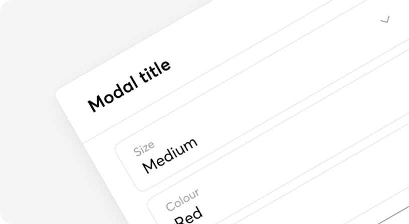
A modal is an interface element that appears over other content. It requires an interaction from the user before they can return to whatever is underneath.
Based on Headless UI.

Anatomy
<Modal>
  <Modal.Backdrop />
  <Modal.Title>...<Modal.Title>
  <Modal.Panel>...<Modal.Panel>
</Modal>
Default
Example with big content
Example with styled content
Example with Select
Modal
| Name | Type | Required | Default | Description |
|---|---|---|---|---|
| open | boolean | Yes | - | Whether the Modal is open or not. |
| onClose | () => void | Yes | - | Called when the Modal is dismissed. |
Modal.Panel
| Name | Type | Required | Default | Description |
|---|---|---|---|---|
| className | string | Yes | - | Tailwind classes for customization of Panel. |
Modal.Backdrop
| Name | Type | Required | Default | Description |
|---|---|---|---|---|
| className | string | Yes | - | Tailwind classes for customization of Backdrop. |