Beautiful UI components, crafted with Tailwind CSS
Components are one of the key building blocks of the design system. Their systematic reuse helps to create visual and functional consistency across products.
Components

Accordion
An accordion is a vertical stack of interactive headings used to toggle the display of further information; each item can be 'collapsed' with just a short label visible or 'expanded' to show the full content.
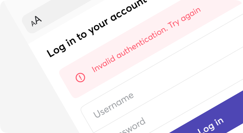
Alert
A way of informing the user of important changes in a prominent way.
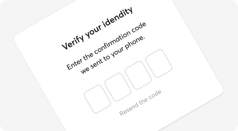
AuthCode
A one-time password (OTP) is an automatically generated numeric or alphanumeric string of characters that authenticates a user for a single transaction or login session.
Avatar
The Avatar component is typically used to display images, icons, or initials representing people or other entities.
BottomSheet
The bottom sheet component is a modified dialog that slides from the bottom of the screen, common pattern in mobile apps.
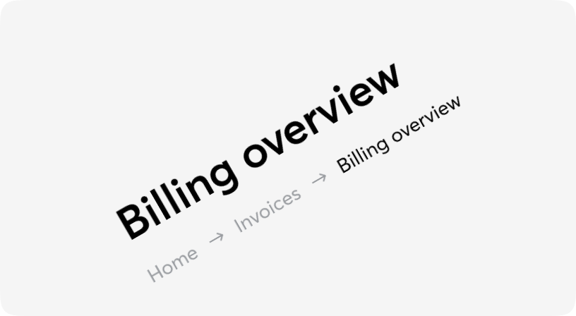
Breadcrumb
A list of links showing the location of the current page in the navigational hierarchy.
Button
Buttons allow users to take actions, and make choices, with a single tap.
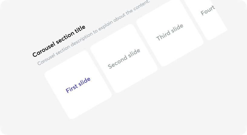
Carousel
Is an effective way of displaying multiple images or content in a single space.
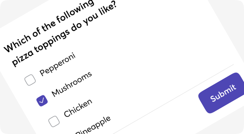
Checkbox
The checkbox is shown as a square box that is ticked (checked) when activated.
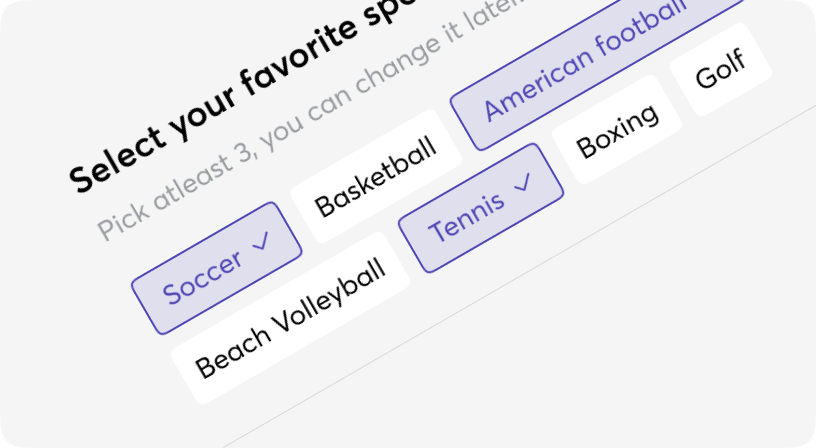
Chip
Chips help filter content, or trigger actions.
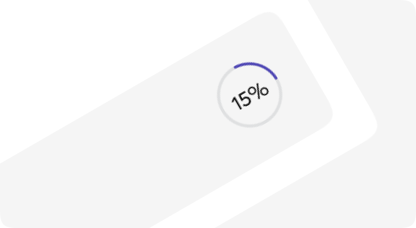
CircularProgress
A progress indicator (Circular and Linear) is a visual representation of a user’s progress through a set of steps, guiding toward the completion of a specified process.
Combobox
An input that behaves similarly to a select, with the addition of a free text input to filter options.
Drawer
The Drawer component is a panel that slides out from the edge of the screen. It can be useful when you need users to complete a task or view some details without leaving the current page.

Dropdown
Dropdowns is a custom select component that allows users to make single or multiple selections.
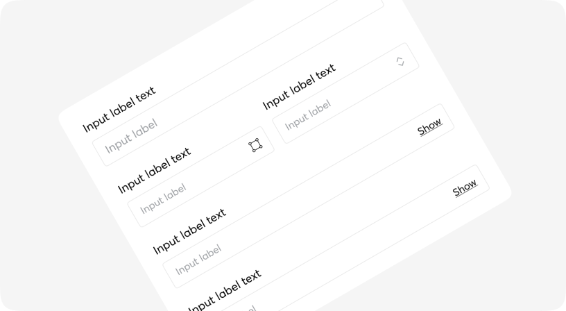
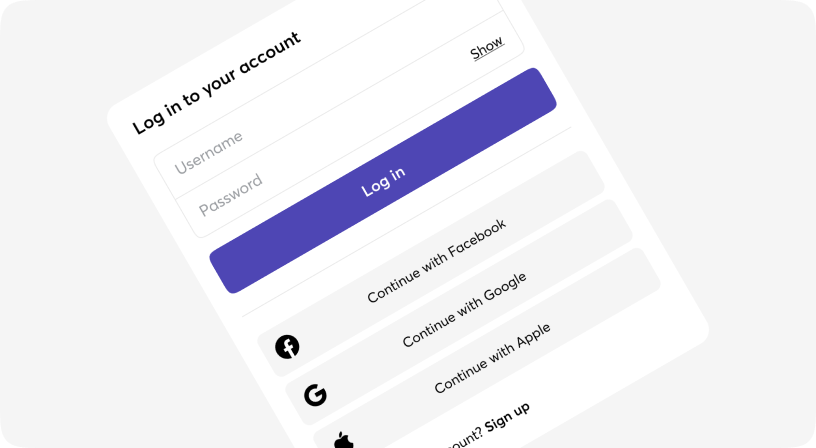
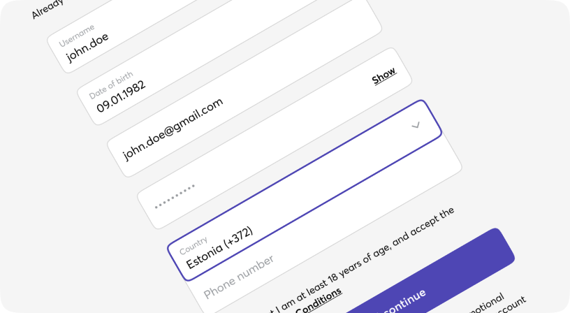
Form
Form component is a grouping of input controls that allow a user to submit information to a server.
Group
Combine different types of inputs into groups to save vertical space on your designs and also simplify form filling.
IconButton
Buttons allow users to take actions, and make choices, with a single tap.
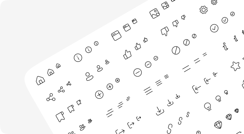
Icons
Moon DS provides a set of commonly used interface icons you can use in your project.
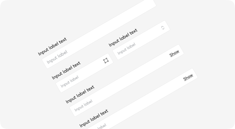
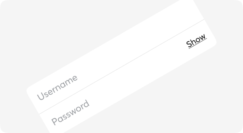
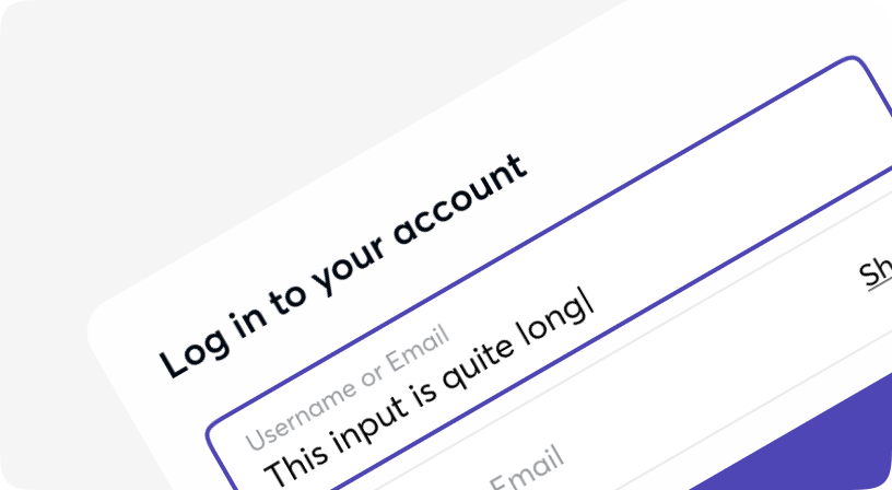
Input
Text input fields allow users to enter text and can be used to collect user feedback or enter information in data entry forms.
InsetInput
Text input fields allow users to enter text and can be used to collect user feedback or enter information in data entry forms.

InsetNativeSelect
A form input used for selecting a value: when collapsed it shows the currently selected option and when expanded, it shows a scrollable list of predefined options for the user to choose from.
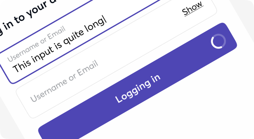
Loader
Loaders provide a visual cue that an action is processing awaiting a course of change or a result.
MenuItem
Menu items are used in such vertical menues and containers as Popovers, Sidebars, Drawers, Dialogs etc.
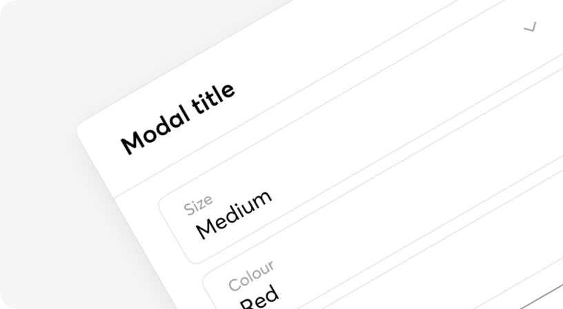
Modal
A modal is an interface element that appears over other content. It requires an interaction from the user before they can return to whatever is underneath.
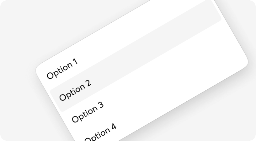
NativeSelect
A form input used for selecting a value: when collapsed it shows the currently selected option and when expanded, it shows a scrollable list of predefined options for the user to choose from.
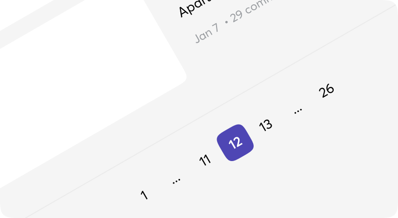
Pagination
Pagination is the process of splitting information over multiple pages instead of showing it all on a single page.
Popover
Popovers are perfect for floating panels with arbitrary content like navigation menus, mobile menus and flyout menus.
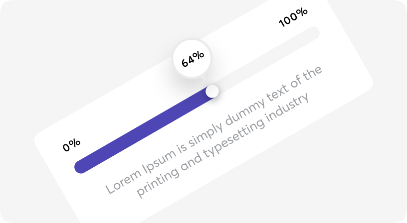
Progress
A progress indicator (Circular and Linear) is a visual representation of a user’s progress through a set of steps, guiding toward the completion of a specified process.
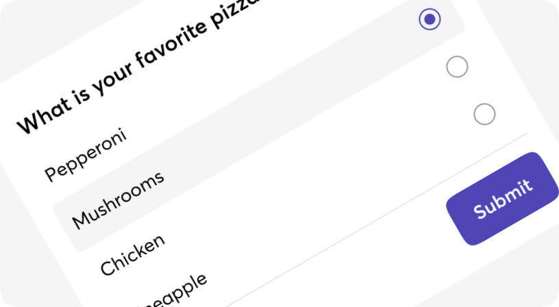
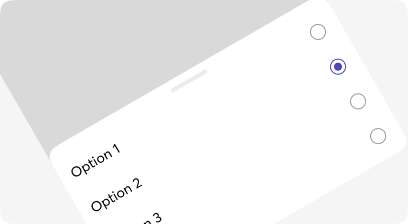
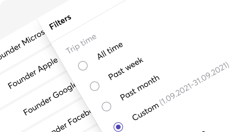
Radio
Radio buttons are used to represent a group of choices whereby users can only select one option.

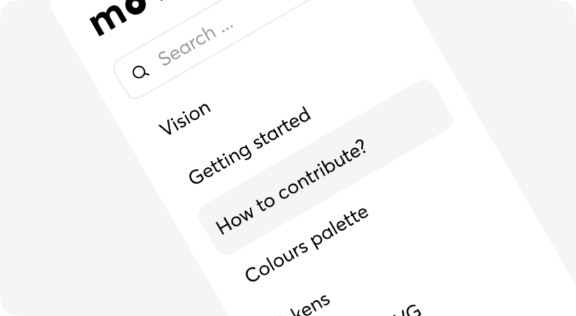
Search
Search enables users to specify a word or a phrase to find relevant pieces of content without the use of navigation.
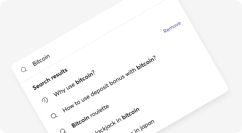
SearchCmdk
Command menu search can be used as an accessible combobox. You render items, it filters and sorts them automatically.
Snackbar
The snackbar component is a non-disruptive message that appears on the interface to provide quick, at-a-glance feedback on the outcome of an action.
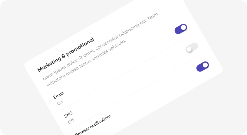
Switch
Switch is a control that is used to quickly switch between two possible states.
Table
A component for displaying large amounts of data in rows and columns.
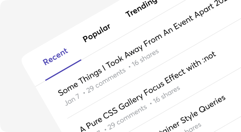
Tabs
Tabs to allow users to navigate easily between views within the same context.

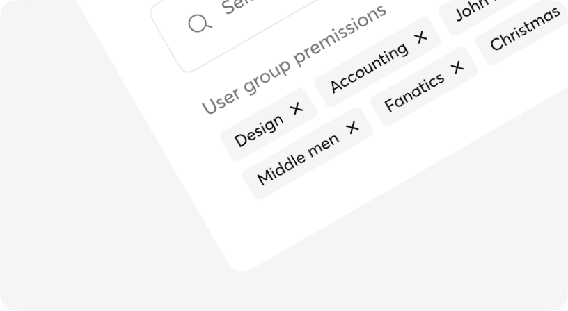
Tag
Tags represent a set of interactive keywords that help organise and categorise objects.
TagsInput
TagsInput is an extension of the text input fields. This component allows users to both enter text and capture input results and display them as well.
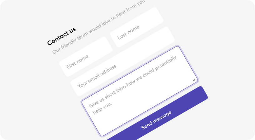
Textarea
A form control for editing multi-line text.
Tooltip
A means of displaying a description or extra information about an element, usually on hover, but can also be on click or tap.