Group
ARIA
RTL
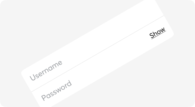
Combine different types of inputs into groups to save vertical space on your designs and also simplify form filling.

Default
Direction
Sizes
Different states
Informative message holder
Informative message holder
Informative message holder
Informative message holder
Informative message holder
Different variant
Group
| Name | Type | Required | Default | Description |
|---|---|---|---|---|
| orientation | vertical | horizontal | No | vertical | Two ways you can stack your input groups. |
| size | sm | md | lg | No | md | Group size |
| error | boolean | No | false | Sets error state for both input/select |
| className | string | No | - | Tailwind classes for customization |
* All the subComponents have the same props as Input, InsetInput, and Select