Switch
ARIA
RTL
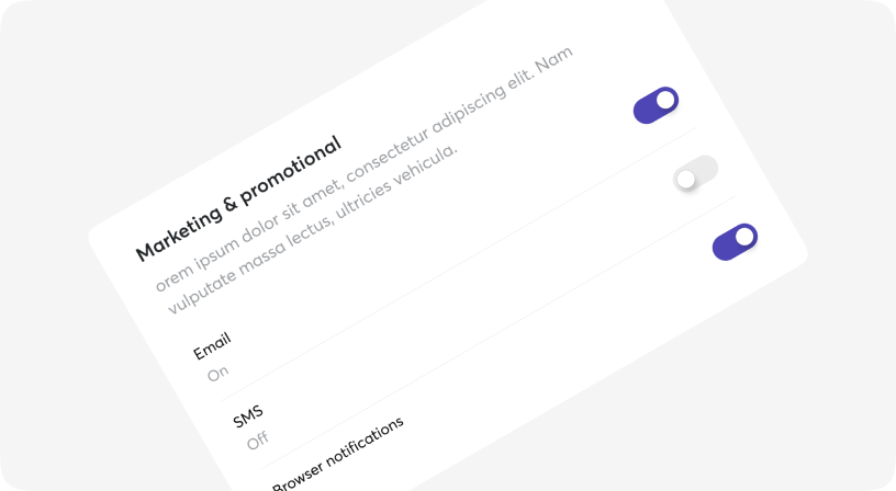
Switch is a control that is used to quickly switch between two possible states.
Switches are only used for these binary actions that occur immediately after the user “flips” the switch.
They are commonly used for “on/off” switches.
Based on Headless UI.

Default
Sizes
Disabled
With icons
Customization
Using with HTML forms
Using with Tooltip
Switch props
| Name | Type | Required | Default | Description |
|---|---|---|---|---|
| checked | boolean | No | false | Is switch checked/unchecked. |
| className | string | No | - | Tailwind classes for customization |
| disabled | boolean | No | _ | Set disabled/not disabled switch |
| name | string | No | - | The name used when using this component inside a form. |
| offIcon | JSX.Element | string | No | - | Set icon for unchecked state |
| onChange | (data) => void | No | - | The function to call when the switch is toggled. |
| onIcon | JSX.Element | string | No | - | Set icon for checked state |
| size | 2xs | xs | sm | No | sm | The option's value. |
| value | string | No | - | The value used when using this component inside a form, if it is checked. |