NativeSelect
ARIA
RTL
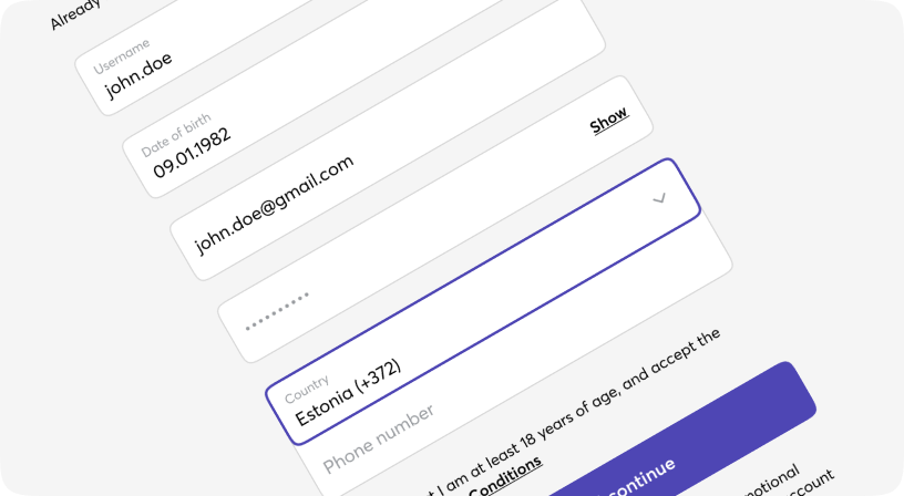
A form input used for selecting a value: when collapsed it shows the currently selected option and when expanded, it shows a scrollable list of predefined options for the user to choose from.
When collapsed it shows the currently selected option and when expanded, it shows a scrollable list of predefined options for the user to choose from. Moon.io supports two types of selects, one whichs opens browser's native styling option list and Dropdown.
Default
Sizes
Different states
Informative message holder
Informative message holder
Informative message holder
Custom styles
Informative message holder
Input props
| Name | Type | Required | Default | Description |
|---|---|---|---|---|
| size | sm | md | lg | No | md | Select size |
| error | boolean | No | false | Sets error state for select |
| disabled | boolean | No | false | Set disabled/non-disabled |
| className | string | No | - | Tailwind classes for customization |