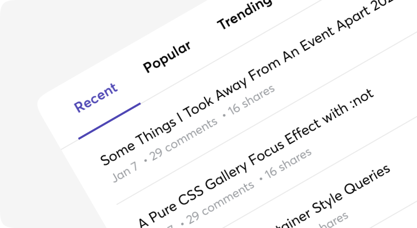
Tabs
ARIA
RTL
Tabs to allow users to navigate easily between views within the same context.
Each tab should contain content that is distinct from other tabs in a set for example, tabs can present different sections of news, different genres of music, or different themes of documents.
Based on Headless UI.
Anatomy
<Tabs>
  <Tabs.List>
    <Tabs.Tab>...</Tabs.Tab>
  </Tabs.List>
  <Tabs.Panels>
    <Tabs.Panel>...</Tabs.Panel>
  </Tabs.Panels>
</Tabs>
Default
Lorem Ipsum is simply dummy text of the printing and typesetting industry. Lorem Ipsum has been the industry's standard dummy text ever since the 1500s, when an unknown printer took a galley of type and scrambled it to make a type specimen book.
Anatomy
<Tabs>
  <Tabs.List>
    <Tabs.Pill>...</Tabs.Pill>
  </Tabs.List>
  <Tabs.Panels>
    <Tabs.Panel>...</Tabs.Panel>
  </Tabs.Panels>
</Tabs>
Default
Lorem Ipsum is simply dummy text of the printing and typesetting industry. Lorem Ipsum has been the industry's standard dummy text ever since the 1500s, when an unknown printer took a galley of type and scrambled it to make a type specimen book.
Selected Index
Lorem Ipsum is simply dummy text of the printing and typesetting industry. Lorem Ipsum has been the industry's standard dummy text ever since the 1500s, when an unknown printer took a galley of type and scrambled it to make a type specimen book.
Selected Index - Segment control view
Tabs only view
Segment control view
Sizes
WithHandler
Contrary to popular belief, Lorem Ipsum is not simply random text. It has roots in a piece of classical Latin literature from 45 BC, making it over 2000 years old. Richard McClintock, a Latin professor at Hampden-Sydney College in Virginia, looked up one of the more obscure Latin words, consectetur, from a Lorem Ipsum passage, and going through the cites of the word in classical literature, discovered the undoubtable source.
With custom styles
There are two ways to add a custom style for the `selected` state: 1) with help of the render prop `selected` or 2) with help of the tailwind prefix `moon-selected: `.
Tabs
| Name | Type | Required | Default | Description |
|---|---|---|---|---|
| onChange | (index: number) => void; | No | - | A function called whenever the active tab changes. |
| selectedIndex | number | No | - | The selected index if you want to use the Tabs component as a controlled component. |
Tabs.List
| Name | Type | Required | Default | Description |
|---|---|---|---|---|
| className | string | No | - | Tailwind classes for styling |
| size | sm | md | No | md | Size of tabs |
Tabs.Segment
| Name | Type | Required | Default | Description |
|---|---|---|---|---|
| className | string | No | - | Tailwind classes for styling |
| size | sm | md | No | md | Size of tabs |
Tabs.Tab
| Name | Type | Required | Default | Description |
|---|---|---|---|---|
| className | string | No | - | Tailwind classes for styling |
| disabled | boolean | No | - | Whether or not the Tab is currently disabled. |
Tabs.Pill
| Name | Type | Required | Default | Description |
|---|---|---|---|---|
| className | string | No | - | Tailwind classes for styling |
| disabled | boolean | No | - | Whether or not the Tab is currently disabled. |
Tabs.Panels
| Name | Type | Required | Default | Description |
|---|---|---|---|---|
| className | string | No | - | Tailwind classes for styling |
Tabs.Panel
| Name | Type | Required | Default | Description |
|---|---|---|---|---|
| className | string | No | - | Tailwind classes for styling |