Input
ARIA
RTL
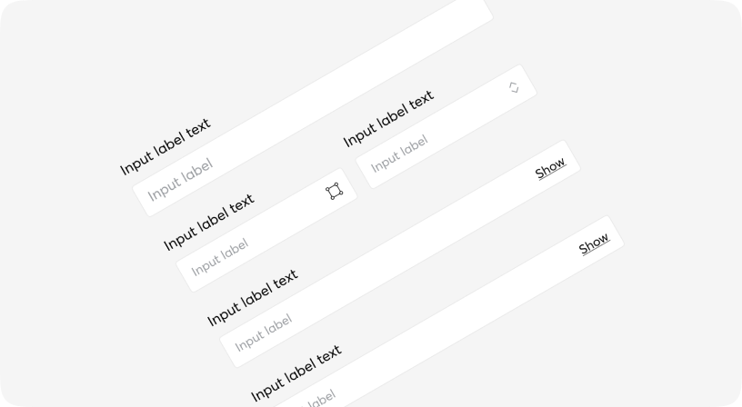
Text input fields allow users to enter text and can be used to collect user feedback or enter information in data entry forms.
These types of input fields are used on their own, or in combination with other inputs such as number entry, date picker, etc.

Default
Sizes
Different states
Informative message holder
Informative message holder
Informative message holder
Custom styles
Informative message holder
TextInput types
Controlling an input with a state variable
Result: FFFFFF
Input props
| Name | Type | Required | Default | Description |
|---|---|---|---|---|
| size | sm | md | lg | No | md | Input size |
| type | date | datetime-local | email | number | password | search | tel | text | time | url | string | No | text | Input type |
| placeholder | string | No | - | Placeholder for input |
| error | boolean | No | false | Sets error state for input |
| disabled | boolean | No | false | Set disabled/non-disabled |
| dir | ltr | rtl | auto | No | - | RTL/LTR direction of label |
| className | string | No | - | Tailwind classes for customization |