Button
ARIA
RTL
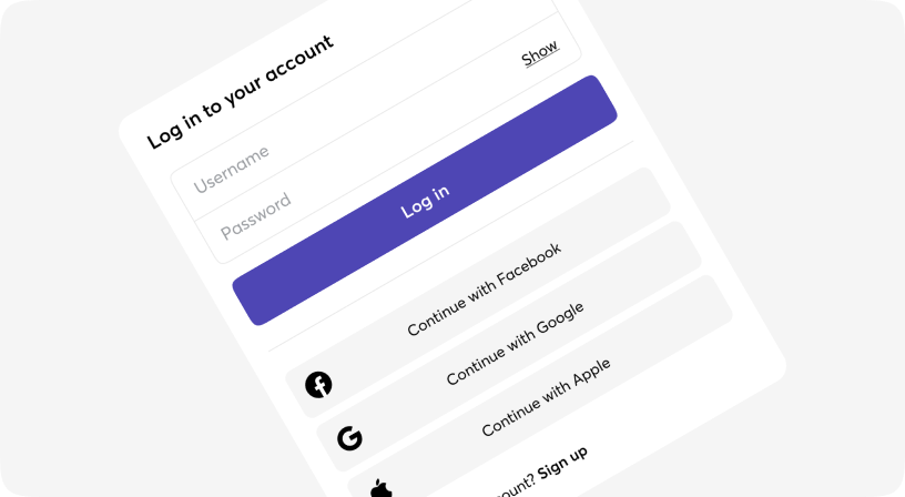
Buttons allow users to take actions, and make choices, with a single tap.
Buttons communicate actions that users can take. They are typically placed throughout your UI, in places like:
- Modal windows
- Forms
- Cards
- Toolbars
Default
Button as a link HTML element
Variants
Sizes
Icons
Full width
Disabled
Animations
Pulse animation is available only for "fill" variant only.
Multiline
Multiline button exists in XL size only. Please copy and paste the code below to see the result.
Button props
| Name | Type | Required | Default | Description |
|---|---|---|---|---|
| animation | 'progress' | 'success' | 'error' | 'pulse' | boolean | No | - | Animation of button |
| as | a | button | No | button | Rendered HTML element |
| children | React.ReactNode | No | - | Children content |
| className | string | No | - | Tailwind classes for customization |
| disabled | boolean | No | false | Disabled button |
| fullWidth | boolean | No | false | Full width button |
| iconLeft | JSX.Element | No | - | Left icon |
| iconRight | JSX.Element | No | - | Right icon |
| size | xs | sm | md | lg | xl | No | md | Size of button |
| variant | fill | outline | ghost | No | fill | Visual/Logical variant of button |