BottomSheet
In progress
ARIA
RTL
The bottom sheet component is a modified dialog that slides from the bottom of the screen, common pattern in mobile apps.
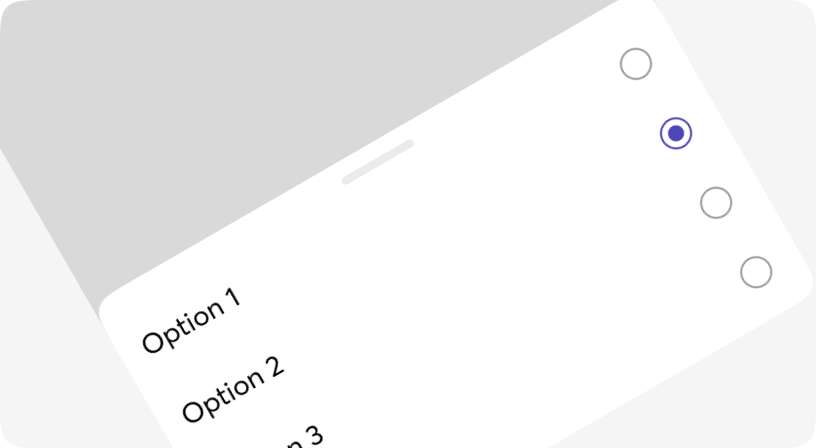
Bottom sheets can contain any anything so let your imagination fly.
Based on Headless UI.
Anatomy
<BottomSheet>
  <BottomSheet.Panel>
    <BottomSheet.Draghandle>
      <BottomSheet.Title>...</BottomSheet.Title>
    </BottomSheet.Draghandle>
    ...
  </BottomSheet.Panel>
  <BottomSheet.Backdrop />
</BottomSheet>
Default
Different sizes
With Draghandle
With Title
Customization
Custom root element
By default, BottomSheet content is inserted as a portal directly into the document.body. If it's necessary to insert a component into a custom DOM node, follow these steps:
- 1. Add the following HTML code in the location where the component should be rendered:
<div id="headlessui-portal-root"><div /></div>
- 2. Set a prop rootId to the <BottomSheet> component with the id of the root element. Example:
<BottomSheet rootId="__next">...</BottomSheet>
By doing this, the "inert" attribute that was added to an ancestor will be removed automatically, and the BottomSheet will become interactive.
Nested
BottomSheet
| Name | Type | Required | Default | Description |
|---|---|---|---|---|
| onClose | () => void | Yes | - | Called when the BottomSheet is dismissed |
| open | boolean | Yes | - | Whether the BottomSheet is open or not |
| rootId | string | No | - | Root element id with inert attribute |
| className | string | No | - | Tailwind classes for customization |
BottomSheet.Panel
| Name | Type | Required | Default | Description |
|---|---|---|---|---|
| className | string | No | - | Tailwind classes for customization |
| onClose | () => void | No | - | Called when the BottomSheet is dismissed |
BottomSheet.Draghandle
| Name | Type | Required | Default | Description |
|---|---|---|---|---|
| className | string | No | - | Tailwind classes for customization |
BottomSheet.Title
| Name | Type | Required | Default | Description |
|---|---|---|---|---|
| className | string | No | - | Tailwind classes for customization |
BottomSheet.Backdrop
| Name | Type | Required | Default | Description |
|---|---|---|---|---|
| className | string | No | - | Tailwind classes for customization |